


Choosing the right interior color scheme is vital for creating a cohesive and inviting space. Colors have the power to influence the mood, ambiance, and overall feel of a room, making them an essential element in interior design. By understanding the impact of color palettes, homeowners can curate an environment that reflects their personal style and enhances the aesthetics of their living space. In this comprehensive guide, we will explore the various aspects of interior color schemes, offering valuable insights into how to select the perfect palette for your home.
Understanding Different Types of Interior Color Schemes
When wondering how to choose a color palette for your home and considering the variety of interior color schemes, it's crucial to first comprehend the various options available at your hand. Monochromatic, analogous, and complementary interior color schemes are the three primary types, each with its unique characteristics and impact on the overall ambiance of a room.
Monochromatic Color Schemes:
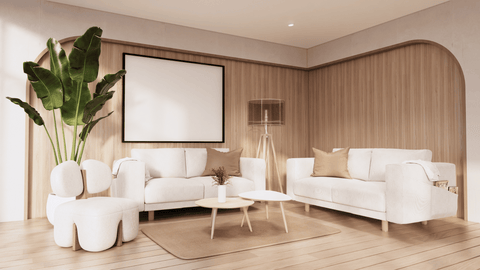
A monochromatic color scheme revolves around using varying shades, tints, and tones of a single color. For instance, a monochromatic scheme might involve different shades of blue, such as navy, sky blue, and teal. These schemes create a cohesive and harmonious appearance, offering a soothing and serene atmosphere. Bedrooms, bathrooms, and study rooms can greatly benefit from a monochromatic interior color schemes, fostering relaxation and concentration.
Analogous Color Schemes:
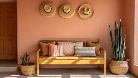
Analogous color schemes are built on colors that are adjacent to each other on the color wheel. These combinations provide a smooth and gentle transition from one hue to the next, generating a sense of continuity and flow. For example, a blend of red, orange, and yellow can infuse warmth and vibrancy into living spaces. Living rooms, dining areas, and kitchens are ideal candidates for analogous color schemes, fostering an inviting and stimulating environment.
Complementary Color Schemes:
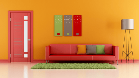
Complementary interior color schemes involve colors that are opposite each other on the color wheel, creating a high contrast and striking visual effect. Pairings like red and grey, blue and orange or purple and yellow can produce a dynamic and energetic atmosphere. Utilizing complementary color schemes in kitchens, dining rooms, or other communal areas can foster a lively and engaging setting, encouraging social interaction and conversation.
Also Read: Feng Shui Colors: A Guide
Understanding these different types of interior color schemes empowers you to select the ideal color palette for your home, considering factors such as room purpose, desired atmosphere, and personal style preferences. Whether you prefer a calming monochromatic scheme, a harmonious analogous palette, or a dynamic complementary combination, the right color scheme can transform your living space into a personalized haven of comfort and style.
Tips for Choosing the Best Color Palette for Your Home

Choosing the right color palette for your home can be a fun and rewarding experience. It's all about creating the desired mood, ambiance, and aesthetics in your living space. Here are some valuable tips to help you select the perfect interior color schemes:
1. Considering Existing Elements
- Furniture: Take a good look at your existing furniture pieces. Consider the colors, styles, and materials used in your furniture. Your color palette should harmonize with these elements rather than clash with them. If you have a predominant color in your furniture, it can serve as a starting point for your palette.
- Lighting: The type and amount of lighting in a room can significantly impact how colors appear. Rooms with plenty of natural light may handle bolder interior color schemes, while spaces with limited light may benefit from lighter hues. Be mindful of the shadows and highlights created by different lighting fixtures when choosing your color palette.
2. Natural Light and Color Palettes
- Harmonizing with Natural Light: Natural light varies throughout the day, influencing how colors are perceived. Consider how your chosen palette will appear in different lighting conditions. Warm colors, like reds and yellows, tend to thrive in well-lit spaces, while cool colors, such as blues and greens, work well in areas with softer lighting.
Also Read: The Benefits of Incorporating Natural Lighting Into Your Home
- Artificial Lighting: Evaluate how your chosen color palette interacts with artificial lighting in the evening. Experiment with different light bulbs and fixtures to determine how they affect the colors you've selected. Understanding the impact of both natural and artificial light can help you create a more cohesive and inviting interior.
Also Read: Brightening Up Your Home: Tips for Finding the Right Home Lighting
3. Psychological Impact of Colors
Each color has its psychological associations. For example:
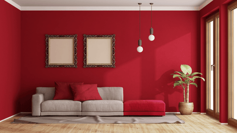
- Red: Energetic and passionate, red is ideal for spaces where you want to create a lively atmosphere, such as dining rooms.
- Blue: Serene and calming, blue is often used in bedrooms and bathrooms to promote relaxation.
- Yellow: Cheerful and vibrant, yellow can brighten up kitchens and playrooms.
- Think about the mood you want to establish in each room, and choose colors that align with those intentions.
- Purple: Symbolizing luxury and creativity, purple can be used in bedrooms or creative spaces to foster inspiration and a sense of luxury.
- Orange: Invigorating and friendly, orange is well-suited for social spaces like living rooms or dining areas, encouraging lively conversations and warmth.
- Gray: Offering a sense of stability and elegance, gray is often used as a neutral backdrop in various rooms, providing a sophisticated and calming ambiance.
- Brown: Reflecting warmth and comfort, brown is a grounding color that works well in living rooms and cozy spaces, creating a welcoming and earthy atmosphere.
- Green: Associated with nature, green can be used in various rooms, especially areas for rest and reflection.
Also Read: The Soothing And Nurturing Effects Of Green Interior
4. Balancing Bold and Neutral Colors
Balancing bold and neutral colors is vital for achieving a harmonious palette. Incorporate bold shades in moderation to infuse personality and vibrancy without overwhelming the space. For instance, pairing a striking red accent wall with neutral furniture like beige or gray sofas creates a balanced, inviting ambiance. Alternatively, introducing bold accents, such as vibrant artwork or decorative throw pillows, in a predominantly neutral room can add pops of color and visual interest. This careful blend ensures a cohesive and aesthetically pleasing interior that exudes both warmth and sophistication.
Also Read: Your Home's Future Look: 13 Interior Design Trends 2024
By following these tips, you'll be better equipped to choose the perfect interior color schemes that suit your home and personal style. Remember, there are no strict rules in the world of color, so don't be afraid to experiment and have fun with your choices.
Implementing the Chosen Color Palette
Once you've chosen the perfect color palette for your home, the next step is to bring it to life. Implementing your chosen interior color schemes effectively can make a significant difference in your interior design. Here are some valuable tips on how to apply your selected color palette throughout your room:
- Painted Walls: Start with the walls, as they serve as the backdrop for your entire interior. Use your main color as the dominant wall color. If you're working with a neutral palette, you can add depth with an accent wall or textured wallpaper.
- Furniture Selection: When choosing furniture, opt for pieces that complement your color palette. Upholstered furniture, such as sofas and chairs, is a great way to introduce your secondary and accent colors. Additionally, consider wooden furniture, which can add warmth and balance to the room.
- Soft Furnishings: Use textiles like curtains, rugs, and throw pillows to infuse your chosen colors. These items can easily be switched out if you decide to update your interior color schemes in the future.
- Artwork and Decor: Incorporate artwork, decorative items, and accessories that reflect your color scheme. This can include paintings, sculptures, vases, and other decorative pieces. These elements enhance the visual cohesiveness of your design.
- Lighting: Consider the role of lighting in your color scheme. Different light fixtures and bulbs can influence the perception of color. Ensure that your lighting choices align with your desired ambiance.
- Accents: Use accent colors sparingly and strategically. These pops of color can be introduced through small decor items such as throw blankets, cushions, and decorative objects. They add personality and vibrancy to the room.
- Patterns and Textures: Experiment with patterns and textures that incorporate your chosen colors. This can include patterned wallpaper, textured fabrics, and area rugs. These elements add depth and visual interest to the space.
- Focal Points: Identify a focal point in the room where your color palette can shine. It could be a feature wall, a piece of art, or a statement furniture item. Highlighting your palette in a specific area draws attention and unifies the space.
- Balance: Strive for balance in your color distribution. You don't want one color to dominate the room, but rather achieve harmony among your chosen shades. Use your primary color as the base and layer the secondary and accent colors throughout.
- Test and Adjust: Before committing to a full-scale implementation, test your color scheme in small doses. This helps you visualize how the colors interact in your space. Be prepared to make adjustments if something doesn't look as expected.
Also Read: Interior Designing: Made It Easy
Conclusion
Choosing the perfect interior color schemes is a key step in creating a cohesive and inviting space. By considering various factors, such as the existing furniture, natural lighting, and the desired mood, you can curate a palette that reflects your personal style and enhances the ambiance of each room. Experiment with different combinations to find the right balance between bold and neutral colors, ensuring that the chosen scheme complements the overall design and layout of your home.
FAQs
How do I select interior color schemes that compliment my existing furniture?
Take cues from the predominant colors in your furniture and choose a complementary color scheme. Consider balancing bold furniture with neutral wall colors to create a harmonious visual appeal.
What are some popular color combinations for different room types?
For bedrooms, soothing blues and greens can promote relaxation, while vibrant yellows and oranges are ideal for energizing kitchen spaces. Neutral tones, such as grays and beiges, work well in living rooms and dining areas.
How can I use accent colors to add character to my space?
Incorporate accent colors through throw pillows, area rugs, artwork, and other decorative elements. Choose accent hues that contrast or complement the main color scheme to add visual interest.
What are the best practices for maintaining a cohesive look with a diverse color palette?
Ensure that the different colors in your palette share a common undertone or temperature. Coordinate the tones of your flooring, furniture, and wall colors to create a cohesive and inviting atmosphere.
